Design mistakes can sometimes lead you in a different direction. Five months ago I showed this design (see below) to Matthew Spiel for some feedback.
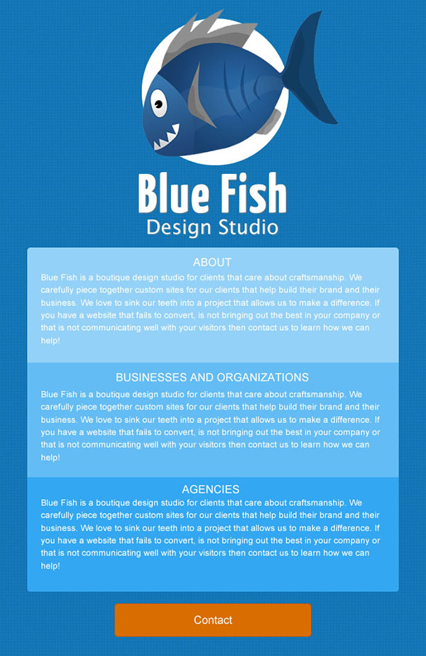
Looking back at it now I can tell I was just being lazy. I just wanted to quickly get a new site up which is the wrong attitude to have when you are trying to sell others on the idea that you know what you are doing. Obviously the design is a rough... aww who am I kidding... the design just stinks. I can smell it emanating from the screen it is so bad. I can't justify any piece of it. But Matt's immediate reaction was that it was morbid?!? Morbid? Why? Matt kindly explained to me that it looked like I had put the fish on a plate... I did not see it before but now that I have had it pointed out to me I could not un-see it.
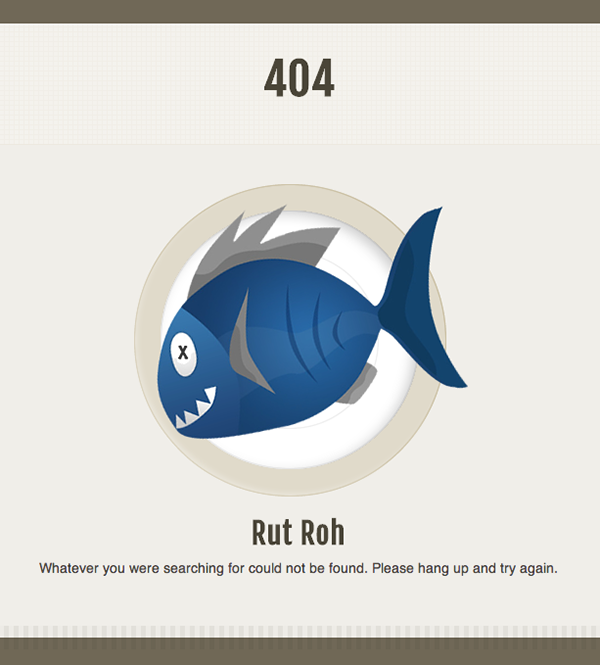
Fast forward 5 months and I was thinking through our 404 page. I wanted something that would be moderately creative without being too out there. I think the Blue Fish logo on a plate idea is perfect :)