For those of you not in the know (like me before I worked at Blue Fish) Show-EE is a small community dedicated to showcasing the latest and best ExpressionEngine websites. There’s no focus on design and/or development - though there is some curation to weed out the truly terrible stuff - just a focus on EE and how different folks in the web industry use it.
Blue Fish Design Studio acquired Show-EE in early 2014 from one of it’s original founders and a former associate of our fearless leader, Marcus Neto. When we took control of show-ee.com it was banking around 500 views a month, upkeep and maintenance on the site was nearly nonexistent and the last recorded upload was from early 2013. Long story short - it was a ghost town. One of the really disconcerting things about this is that the ExpressionEngine community as a whole was kind of seeing this downward shift everywhere. A couple of shake ups at EllisLab and some unanswered emails caused the term “abandon ware” to be thrown around a lot. ExpressionEngine for all its faults is still now and will be for the foreseeable future one of the most scalable and robust content management systems available. We strongly believe that the #eecms community is alive and well and only getting better. Through that belief we have committed ourselves to giving show-ee.com a facelift and working to get it back online to foster the growth of the #eecms community at large.
So we made all these promises to ourselves and the community and then shit got real - I have to actually redesign this massive site with new content and clever tag lines and all the things. I’m a nervous guy by nature, so no pressure when designing a forum for developers of one of the most prominent Content Management Systems on Earth, not that EE developers are picky or anything... The task at hand was a mighty one but a few nights of research and The Glenfidditch led me to put together some wireframes and concepts that seemed like they might be viable.
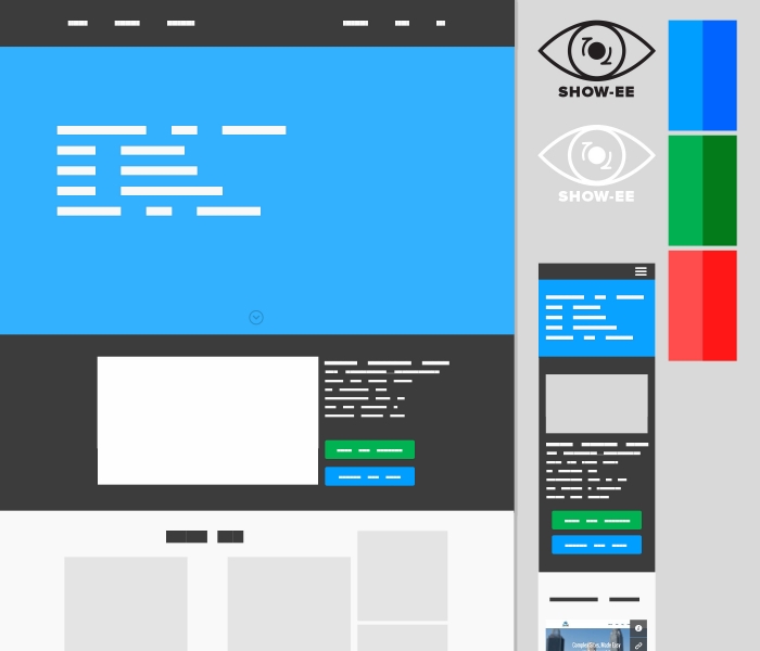
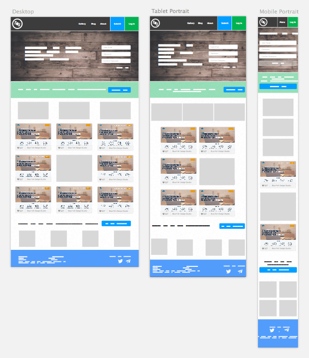
I worked through the design mobile first with some content being created on the fly, but being created in line with the tone that we're working towards: casual and friendly but knowledgable. The design was well recieved but after a couple rounds of critique we refined some of our ideas and our layouts and nixed a few things that weren't making sense. Specifically, the new mark was really not jiving with the rest of the design. It threw off the balance of the rest of the site, sat a little too high in the header and really just generally wasn't working - it took me some time to be ok with that because I thought I was being clever. After paring away a few things we settled on a refined mark and a similar color palette.
Boom, a brand is made. We have our logo we have our design but wait... something's wrong. In all the furious designing and Scotch drinking and research I did, I completely forgot to do normal, basic, even standard - every single project things. I didnt have a site map, I didnt check analytics data, I basically screwed everything up from the word go. Why did i do this? Because I was being selfish, shortsighted and hasty (if some of this sounds familiar, it's because I wrote a shorter and less embarassing post on this here.) I wanted this site designed and ready for production this very minute and because of that, the work suffered and I was staring down the barrel of several wasted hours and new projects rolling in that I had to start on. It was terrifying and I was embarrassed to say the least. I took this to Marcus and Tad and explained to them that the pooch was screwed and it was my fault. Tad had already started working on development of a few small parts and I was coming to him letting him know that they were wrong and our timeline would need to be extended. After talking me off a ledge and thinking through some of the things that were missed not just in design but in all the aspects of the redesign, we regrouped and I began working on a workflow.
We do workflows for our clients to show them how the site will work but also to make sure that our overlap from project management to design to development is really painfully obvious. It shows every page with every interaction that is worth making note of. In some cases there are more interactions and in some cases less. In the case of Show-EE, we tried to make sure everything was there. This was one of the first time we used Eric Miller's UX Kits for showing these flows and it worked wonderfully.
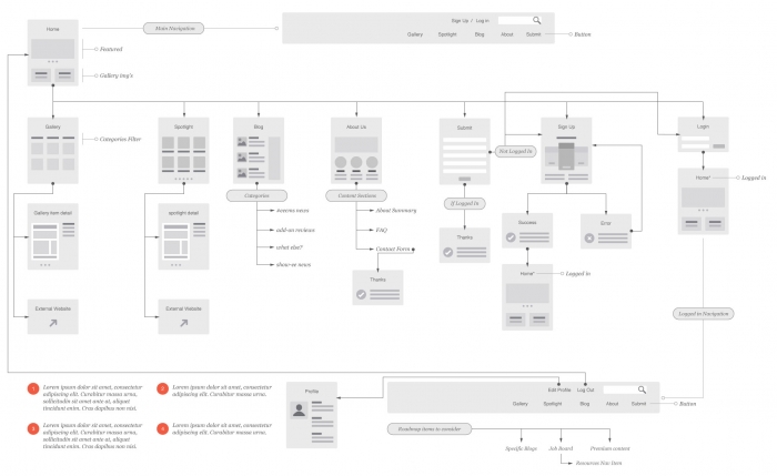
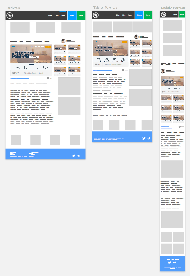
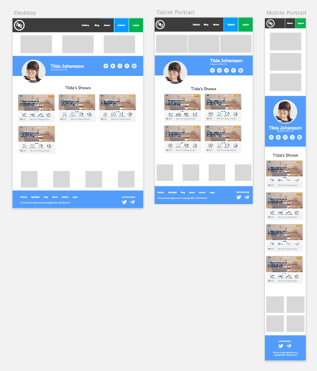
One of the main things we left out of our thought process is the fact that we wanted people to be able to log in and keep up an actual profile, linking all their posts to their profile and potentially to the company they work for. This was integrated into an early workflow (seen above) that was refined even further as we went on. We talked through a lot of what was wrong with the old show-ee.com - users couldn't upload their own images, there was no way to catalog multiple entries by a single company, the ads got in the way of everything - there were multiple issues we had to figure out. This type of workflow, more visual now than we'd ever done before, was letting us see all the chinks in the armor. We made some tough decisions, like killing the showcase and add on reviews as separate areas of the site. We've compiled all of those things down to entries in the blog. Which is a shame because I was really psyched on the design of them, they just aren't relevant enough to be whole sections.
Back to square one. In the weeks between dropping the ball and realizing we needed to start over, I had begun using Sketch 3 (be on the lookout lookout for my extended post on Sketch and it’s use at Blue Fish) alongside Photoshop and Illustrator to mock up wireframes and to do little things that needed doing here and there. Tad and I had been talking about potentially using Sketch full time or most of the time anyway, because of it’s exporting abilities and what that might mean for an even more overlapped workflow. Show-EE presented itself as the perfect project to do a dry run on. So we did.
With a newfound clarity and a workflow document sitting in front of me, much in the fashion that we approach client projects, I started wire framing out some new ideas. A lot of things stayed the same - top nav, hero image, color palette. Something changed though, this process was moving a lot faster than before, even with the added complexity of profiles, login/log out issues, success pages, etc. I was designing with the full picture in front of me - a workflow that detailed all our necessary interactions, content from the previous iteration to work off of and a clear path to really work through the design. What came out of the re-redesign has been a lot more successful and has felt a lot less piecemeal.
* I’m not going to go on and on about what Sketch has allowed us to do in terms of designing mobile first, having a really clear plan for going into dev or allowing me to start dev without Tad (which I did on this project without telling anyone), I will say thought that I’m a fan and it’s working for me. *
We’ve been able to maximize ad space - especially for more cost effective options - without impeding on the user’s ability to view and interact with the site. We’ve simplified the Shows (thats what we’re calling the uploads, Shows) and made profiles a reality so the person is connected to the project but the person does not become the main focus. We want the profiles to be available but the story of how the work was done to be the centerpiece.
The other side of the “work is the most important thing” coin is that we want to eventually have a robust profile system for users. Right now we’re getting everything set as the minimum viable for launch but eventually we want to make this a place where EE developers have a profile that allows them to do things like post jobs on a job board or have discussions about EE and design & development in general.
We’re not shooting for the moon or anything with Show-EE but the process it’s taken for us to get to this point has been a long one. Design and redesign, constantly rethinking content and adding features to our roadmap. There’s a lot more to relaunching something like this than I expected. So far it’s been crazy rewarding and a heck of a lot of fun. Blue Fish is crazy excited to get Show-EE launched and try to work some more life into our #eecms community.
Let us know what you think about the launch, questions about the design or the future of Show-EE in the comments! Thanks for reading.