
Another Sea Grant Website? You're dang right! We are welcoming texasseagrant.org to the internet as of today. This is another one of the 33 partnerships that match NOAA Sea Grant expertise and resources with state academic institutions. After launching the MASGC website we saw some possible merit in speaking to other Sea Grant directors about their individual missions as well as their overall goals. The folks at Texas Sea Grant were already working toward a redesign and we spoke with one of their representatives at just the right time to offer some guidance and get some feedback on some of our assumptions about Sea Grant organizations.
Getting Started
The Texas Sea Grant team were excited to get started, We pushed out our standard project kick-off Typeform survey to all their stakeholders so we could gather information on the project from many different angles. We got feedback from the Executive Director all the way down to some of the locally based team members. Their feedback was invaluable, as they are a large part of the user base we were catering to. We established three basic user types: The Researcher, the Community member and the Civil servant. Each persona was built to have very specific needs and uses for the new site.
The Researcher/Student - A student or researcher looking for information about specific parts of the TSG organization or specific research they have done. This user is generally early 20’s to late 30’s with at least some higher education and is probably heading straight for the research navigation link. This user will most likely want to be able to browse technical publications as well as current news.
The Community Member/Visitor - This user is kind of all over the place as far as demographics go. We’ve tried to design the content to allow this user to find events and local area representatives as easily as possible. We can probably rule out the use of certain parts of the site for this user - without generalizing too much - but making sure even the more technical areas are easy enough to understand is key.
The Civil Servant/Voter - While the Community Member and Voter might be the same person, we are targeting intention. While the Community Member is looking for events and news, the Voter/Civil Servant is looking for information about funding and allocation of said funding. This user is looking for programs, funding information and general justification for its existence.
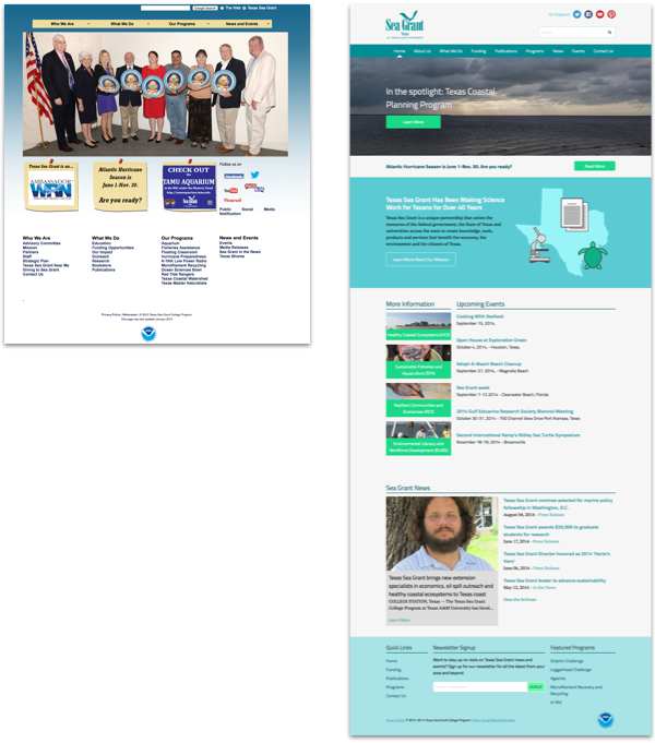
Having these basic personas on hand helped us make a lot of decisions about the direction of the site as well as the functionalities that needed to be tier one in the global hierarchy. The TSG site spans over 600 pages, so having that hierarchy mapped out was key.
Content is Still King and ExpressionEngine is Merlin
TSG has a lot of content. Like a whole lot. We’re talking downloadable publications all the way back to 1972 and they release several new pieces of content every week via their press release and events channels. The largest pieces to that content puzzle were the dozen or so programs that operate under the umbrella of TSG. Part of the original scope of this project was to move these programs onto the same server and under the same roof (so to speak). This meant that what was previously a separate but similar web experience to the TSG home page would now become a sub-page to the main site. This would push the program coordinators to post ALL relevant content into its individual channel and represent Texas Sea Grant as a single body with the programs forming the bones. One of the most complex parts about reforming these content channels was deconstructing individual pieces to configure a set of custom fields that would allow all the TSG team members - from leaders down to coastal reps - to publish content quickly and easily. Published content was only one part of the equation. As I mentioned, TSG has content in the form of publications and scholarly papers dating back 30+ years as well as a whole host of deeply linked sub-sub pages. To make this work we used Pixel & Tonic’s Matrix add-on in conjunction with Iain Urquhart’s Nolan.
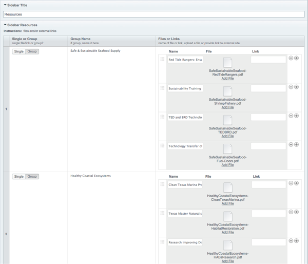
Matrix is amazing and in pretty much all EE developers’ toolbox. Matrix allows us to expand EE’s fields into complex and varied field sets. The issue though was that TSG had some content that was so deeply nested, Matrix couldn’t handle it all by itself - that’s where Nolan came in and blew our minds. Iain developed Nolan to nest Matrix fields within other Matrix fields (Iain worked directly with us - like a champ - on implementing Nolan and we definitely owe him a beer.), making our lives a lot easier and keeping the content structure the clients requested intact. Did I mention that this site is bilingual? Oh yes, it totally is and we couldn’t have made that possible without Matrix and Nolan of course, but the bilingual star is Transcribe. Tom and the guys at EEHarbor really killed it with Transcribe and worked hard with us on making sure it did what we needed it to! (we owe a lot of people beers).
Designer’s Corner
In the last several months Blue Fish has really developed a new way of designing client sites. We’re trying to invest ourselves in a Visual Inventory workflow and I (Keaton) am taking on a lot more front-end development responsibility. We’re showing clients visual assets a lot earlier and deliverables are becoming more and more interactive. In developing some options for our visual inventory we identified a few different voices and eventually settled on something mostly informal but informational and a tad whimsical. From there I started looking for some colors to compliment their brand and some illustration styles that might make sense for scientific and academic visuals with a lighter side. I designed icons and animals and scientific equipment to refine the visual style and the end result was something we were all happy with and the TSG team really loved.
The actual page structure and layout design was a breeze after Kara and Marcus worked up a really exhaustive site map document. Using that as a jumping off point, I worked up a really common sense site structure. The previous TSG site was made up of 4 top level navigation links with on-hover drop downs. Several of these pages contained in the drop downs were 3-5 sentences with several links. The client’s desire to eliminate unnecessary complexity when navigating the site led us to make the top level navigation extremely straightforward with limited drop downs and content rich pages.
The Wrap-Up
The TSG site - as exhausting as it was at times - was a labor of love. We’ve really connected with our Sea Grant clients and we’re excited to see what they do next. Having this kind of project to really dig into content, design and experimenting with some new development strategies is exactly the kind of project we love. Do you have a project coming up you need to speak to someone about? Have questions about any of the awesome tech or developers we talked about here? Let us know in the comments or holler at us on Twitter!