Recently we launched a new website for Mississippi-Alabama Sea Grant Consortium (MASGC). The MASGC is one of 33 federal/state partnerships that matches NOAA Sea Grant expertise and resources with state academic institutions. This project was 5 months in the making and we are very proud of how it has turned out.
When you look at the new site you can't really get a feel for the magnitude of the project. One of the largest aspects to this project was information architecture. Previously there was none (joking).
For those of you reading this that are not part of the web industry, information architecture is basically the organization of information on the site. It is how you make a site make sense to folks outside of the organization. Internally you may see things a certain way but externally, to the lay person, the expectation might be different. When that happens the expectations of an external visitor always take precedence over what internal folks may want to see.
Did I mention the Data migration? I think Jared got a trial by fire with this site. They had content dating back to the 1970s! Thankfully they were open to leaving off some of the older publications. But all of the text had to migrate to the new location on the new site (if it was maintained)
This site is an example of why I love ExpressionEngine so much. No matter what type of content we threw at it EE absorbed it. And made it easy for the non-technical folks at MASGC to update their content.
For the ExpressionEngine folks that are reading this... This site has 34 Channels, 22 channel field groups, 121 Custom Fields. We also used 21 Template Groups and 35 Templates.
As for Modules we used Backup Pro, Calendar, Channel Files, Channel Images, Channel Videos, Forms, Title Master, Updater and Wygwam. We used Freebie, Stash, Matrix, Playa, Hon-ee Pot, Low Seg2Cat, Single Entry Extensions. And we used a couple of other add-ons like P&T Pill, MX Jumper, Switchee, and TruncHTML.
Of course we had channels that are a page layout, but for the most part the channels are different types of content. For instance, Projects, Calendar, Forms, Publications, Gallery, Locations, and People are just some of the types of content that we had on this site. So we created the channels for those pieces of information and then used Playa fields all over in the other Channels so that they could associate content that goes with what ever entry they were putting into the system.
One of my favorite examples of ExpressionEngine's prowess is the People section. We called it people cause it includes people outside of the immediate staff. So if they have someone write a blog post that person can be put into the People Channel and in the News section they can associate the Guest Blogger to the News entry and their information will show up on the page with their contact info. This way the person's information can be reused and there is just one location where any updates might need to be made if their email or phone number changes.
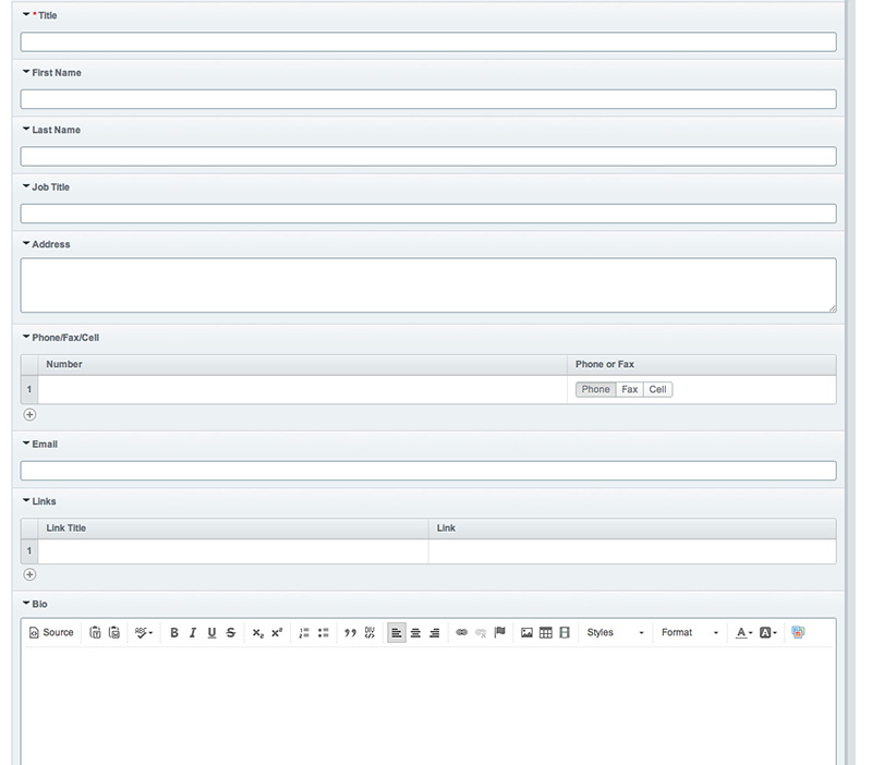
For the People Channel we have custom fields for First Name, Last Name, Job Title, Address, Phone/Fax/Cell (matrix field with pill for type of number), Email, Important Links (Matrix field with Link Text and URL), Bio, Organization, Project Info, Social Links (Matrix field with Pill for type of Social Account and URL), Pictures (Channel Images), and Focus Area (Playa Field). We also use the categories to decide whether the person is part of the Staff, Board of Directors, Management Team etc. It is this type of granularity that really makes EE shine. To be able to use the same content on a Program page, News Article, Staff, Management Team or on the filterable list on the contact page is really nice and makes the maintenance of the CMS much easier for clients.
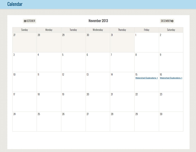
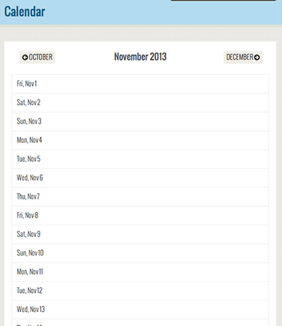
The site is also responsive. With large sites like this it is always a challenge to get the site structured in a way that makes sense at different breakpoints. I think Tad did an excellent job of it though. One area that I am most impressed with is the Calendar.
Desktop through larger tablet sizes show a monthly view...
But when you get to a mobile device the layout re-orients itself.
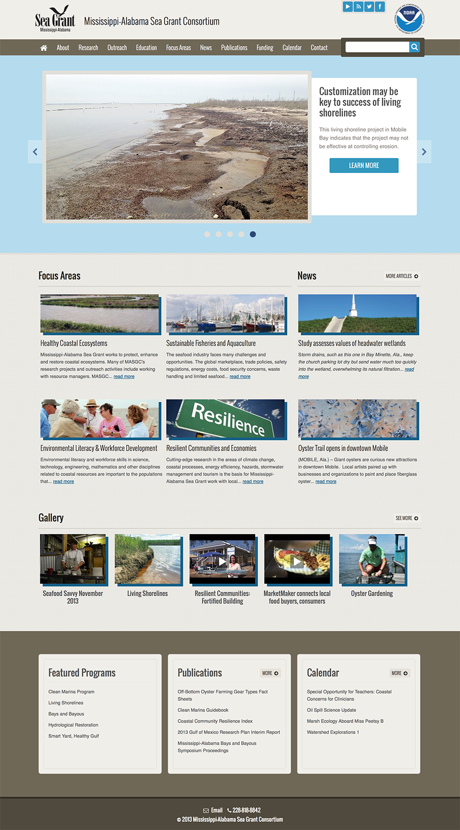
As for design, MASGC works with a lot of groups but many of those groups are associated with the Gulf Coast. We wanted a color scheme that worked with a water and sand motif. There is a lot of content on this site so Search was an important aspect of the design. Making it simple for folks to find content that might be buried deeper in the site. We used images on the Research, Outreach, Education and the Focus Area pages to bring a human aspect to the site. Because there was a lot of content associated with each page (News Articles, Galleries, Projects, Contacts, Programs and more) we opted for a 3 column layout on some of the pages. This was the easiest way to keep all of the associated content front of mind.
We are really proud of this project. It has brought us together as a team. And I think many of you will understand what I mean when I say it feels good to see it launched. Special thanks to the MASGC crew for being so awesome to work with. We look forward to continuing the relationship.